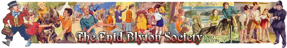
And they've made the usual error in thinking it was a cottage instead of a workshop that caught fire. Why wasn't it called The Mystery of the Burnt Workshop?
Thanks for that, Pete. An interesting interpretation of that particular scene. I think I actually probably prefer the back cover over the front: the bit with the silhouette which is very atmospheric and alluring... I also like the colours. However the children and certainly Mr Goon are not very accurate to the text and their appearance does not really preserve the era in which the stories were written. And as Nigel said: the house is on fire and not the workshop! I suppose the title is a little bit misleading, but you would have thought the illustrator would have read the book before creating a front cover for it.
"Beware of young men with long hair - that's what dad says, isn't it?"
Pat, Holiday House
I guess the cover is colourful enough for todays children, and will hopefully sell the book.
I expect the title is confusing because anyone not having read it would think that it was a cottage that was on fire, and not a workshop. Maybe the illustrator hasn't read the book!
Julian gave an exclamation and nudged George.
"See that? It's the black Bentley again. KMF 102!"
Also, strangely enough, the "cottage" seems to be on fire without being consumed... any relation to Moses and the burning bush??
("And when Goon saw this great sight, that the cottage was not consumed, he turned himself aside to see; and a voice called unto him out of the midst of the cottage, saying, Theophilus, Theophilus..."
...sorry, got a bit carried away there. Besides, this book was before Fatty learned ventriloquism. )
Society Member
It was a nuisance. An adventure was one thing - but an adventure without anything to eat was quite another thing. That wouldn't do at all. (The Valley of Adventure)
Interesting. Did Egmont ask several artists to come up with possible designs in 2013, and then choose the artist they preferred? Looking in the Cave, the 2014 cover was actually illustrated by Timothy Banks.
"Heyho for a starry night and a heathery bed!" - Jack, The Secret Island.
"There is no bond like the bond of having read and liked the same books."
- E. Nesbit, The Wonderful Garden.
I don't like the cover very much - the children (and even the policeman) looks more like a couple of cartoons from a latest TV show than respectable characters from a wonderful series! The illustrator has ridiculed the characters!Unfortunately, there are many covers like this nowadays - don't ask me why!
I don't care for the cover very much but it's this style of illustration that appeals to the new young reader and that's got to be good. Anyway, it doesn't matter whether I like it or not, I've got my hardback copy so I won't be buying it.
John Pickup wrote:I don't care for the cover very much but it's this style of illustration that appeals to the new young reader and that's got to be good. Anyway, it doesn't matter whether I like it or not, I've got my hardback copy so I won't be buying it.
As we can see in the Cave (click on the link in Tony's post above), the Wesley Robins cover was never used. Timothy Banks was chosen to illustrate the latest Find-Outers covers.
"Heyho for a starry night and a heathery bed!" - Jack, The Secret Island.
"There is no bond like the bond of having read and liked the same books."
- E. Nesbit, The Wonderful Garden.
Anita Bensoussane wrote:
As we can see in the Cave (click on the link in Tony's post above), the Wesley Robins cover was never used. Timothy Banks was chosen to illustrate the latest Find-Outers covers.