To be honest, the main reason I hated the Strange Ruby cover as a child was that my version had the children's eyes all coloured in with red Biro! I agree it's a good style and the overall design is well drawn.
That painting of Mr Goon is indeed a classic - and I'm sure it 'won' J Abbey the contract to illustrate the series...although as I've shown in the past, he was fond of reusing the illustration, or parts of it, for the rest of his time as illustrator!
'Oh voice of Spring of Youth
hearts mad delight,
Sing on, sing on, and when the sun is gone
I'll warm me with your echoes
through the night.'
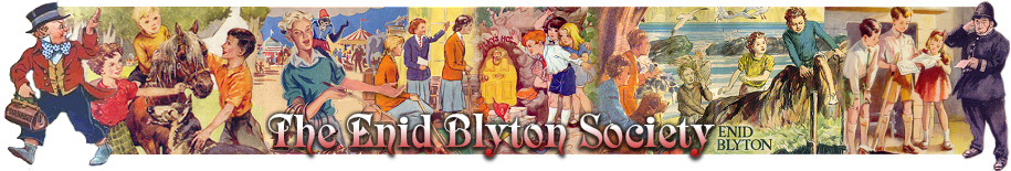
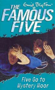
This cover is the perfect example of placing the shadow that looks real. Drawing shadow is very difficult to achieve! You only know this fact if you have gone through this. Richard Jones is a very talented illustrator! In addition, the proportion of Anne and George while squatting is excellent. Beautifully and realistically done!
Last edited by sixret on 08 Oct 2016, 18:02, edited 1 time in total.
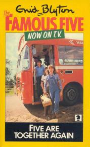
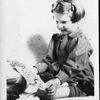
This one from Five are Together Again.
It does not show all the children or Timmy the dog and it gives no clue what the story is about. It's just a photo of some kids getting off a bus
sixret wrote:Actually, the second cover of Five Go Off To Camp is great. There's an attention to detail, perspective, shadow and all. I think it looks(all covers in 1992 version for that matter) professional, beautifully done with high taste although the reaction may not be accurate.
sixret wrote:
This cover is actually difficult to draw because it must be drawn with correct perspective, with correct and logical placement of shadow. The proportion of heads look upward and body in that position is very difficult to attain in drawing! This illustrator is very talented, in my opinion!
This cover is the perfect example of placing the shadow that looks real. Drawing shadow is very difficult to achieve! You only know this fact if you have gone through this. Richard Jones is a very talented illustrator! In addition, the proportion of Anne and George while squatting is excellent. Beautifully and realistically done!
It's hard to tell from the small-size images, but I get the impression (not having seen any of them in real life) that these particular Famous Five cover pictures are photos - or heavily based on photos - not freehand drawings. Does anyone know for sure?
Society Member
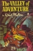
It was a nuisance. An adventure was one thing - but an adventure without anything to eat was quite another thing. That wouldn't do at all. (The Valley of Adventure)
Crwban wrote:This one from Five are Together Again.
It does not show all the children or Timmy the dog and it gives no clue what the story is about. It's just a photo of some kids getting off a bus
This TV cover, along with On Kirrin Island Again and Plenty of Fun, were the first FF books i recall seeing as a child so I've always had a soft spot fir them.
When they first came out, I admit I disliked the TV photo covers, as I was used to the Betty Maxey ones - but now I have a great feeling of nostalgia for the TV covers. They depict my own childhood in a way - the fashions, the hair styles and the long hot parched summers!
'Oh voice of Spring of Youth
hearts mad delight,
Sing on, sing on, and when the sun is gone
I'll warm me with your echoes
through the night.'
I feel the same. I didn't have any of the TV covers as I already had all 21 books in the Maxey covers but seeing them now always evokes great nostalgia. I have now picked up about 8 or 9 of them and will maybe complete the set one day.
"What a lot of trouble one avoids if one refuses to have anything to do with the common herd. To have no job, to devote ones life to literature, is the most wonderful thing in the world. - Cicero
I agree with most about the appalling effect of those cartoon-style covers - I can hardly find the words to describe how bad I find them.
While the Famous Five ones by Richard Jones are not in that order of badness, I don't find them in the least interesting or attractive, either - however technically skilful they may be. I don't know much about illustrating, so I won't argue about the statements that he is very talented. Quite possibly so; but those covers just seem to show a couple of kids crouching or standing somewhere in a vaguely dark or sinister situation, but without managing to convey what is happening, or without even giving any clues about the story. I like a cover to show something interesting about what the story is about and/or to vividly evoke the atmosphere of the story in some way. (Yes, I know the latter in particular is a very subjective assessment; but most of these covers discussed here fail on both those criteria, to my mind.)
I have never been attracted to T.V.-related covers of any books. Books and television seem (to me) inherently opposed in various ways, so covers derived from television versions never convey a nice feel of the books to me. Sometimes they also seem to be depicting very mundane scenes, even if they were part of the story (such as the one showing children getting off a bus - how thrilling that is!).
However, I dislike television as a medium, its practices and culture, and I do not own a television, and have no plans to get one at any time; so I suppose I must admit to a bias against television.
MJE wrote: I agree with most about the appalling effect of those cartoon-style covers - I can hardly find the words to describe how bad I find them.
Fortunately, children like them! I have been watching Charlie and Lola with my grandchildren and they are drawn in a similar vein to these covers. They both love the series yet neither has criticised the appearance of the children.
Yes...but Charlie and Lola has always been drawn like that. That depiction IS what Charlie and Lola are supposed to look like. I'm still not convinced that children like a particular thing...children accept a particular thing, maybe, but that is quite different!
Its a bit like saying the Mr Men were unrealistic but children liked them - the Mr Men were meant to look the way they do, but if The Famous Five were to be drawn the same way, would that be equally as acceptable?!
Also as I've mentioned elsewhere...if the publishers were 100% sure that the cartoon covers are 100% popular they would do away with the Eileen Soper covers completely...but they always hedge their bets by having both styles available at the same time
'Oh voice of Spring of Youth
hearts mad delight,
Sing on, sing on, and when the sun is gone
I'll warm me with your echoes
through the night.'
Children have always recognised cartoony style characters as opposed to real actors ... and I suppose they just enjoy the actions and the story .... Come to think of it, the style of drawing is very similar to the early efforts of most people! Perhaps that's why children can relate to them.
'Tis loving and giving that makes life worth living.
Publishers aren't stupid. I suppose they offer both sets of covers to cater for the purchaser; a child is more likely to buy the cartoony cover whereas an adult will be drawn towards the Soper cover if buying the book for a child.